Working with asthmatics
This is a quick summary of a previous research into how asthmatics would interact with a wireless air quality system.
Air Quality? Like Outside?
Mention “air quality” to people and they may tacitly assume you are talking about the outdoors. But a lot of what we do indoors impact the air quality of our homes, as well. There’s the usual stuff you might expect: cooking, cleaning, etc. But also some things you would not expect: making the bed, vacuuming, doing laundry.
As something that’s mostly (hopefully!) invisible, air quality can be easy to ignore. While invisible, it is higly dymanic and interconnected with the rest of you living space in ways you might not expect. Does the cooking in your kitchen affect your bedroom? How would you even know?
Detecting air quality – which boils down to measuring the concentrations of small, airborne particulates (those 2.5 microns and below, in our case) — is something your average, everyday person hasn’t been able to do from a lack of affordable or commercially available systems. This has started to change of late, but was the motivation behind our project in 2017.
The System
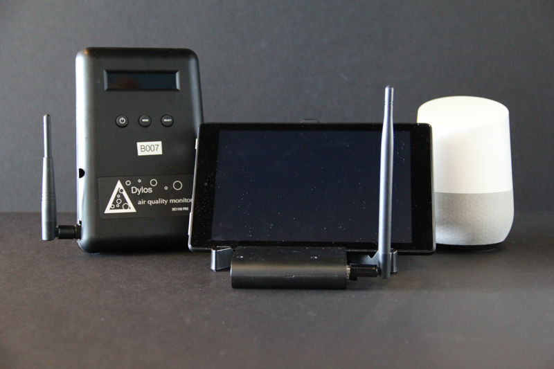
We hacked some off-the-shelf Dylos air quality sensors to add local datalogging and wireless transmission capabilities. The software architecture behind this was very non-trivial and received it’s own write-up for a sensors conference.
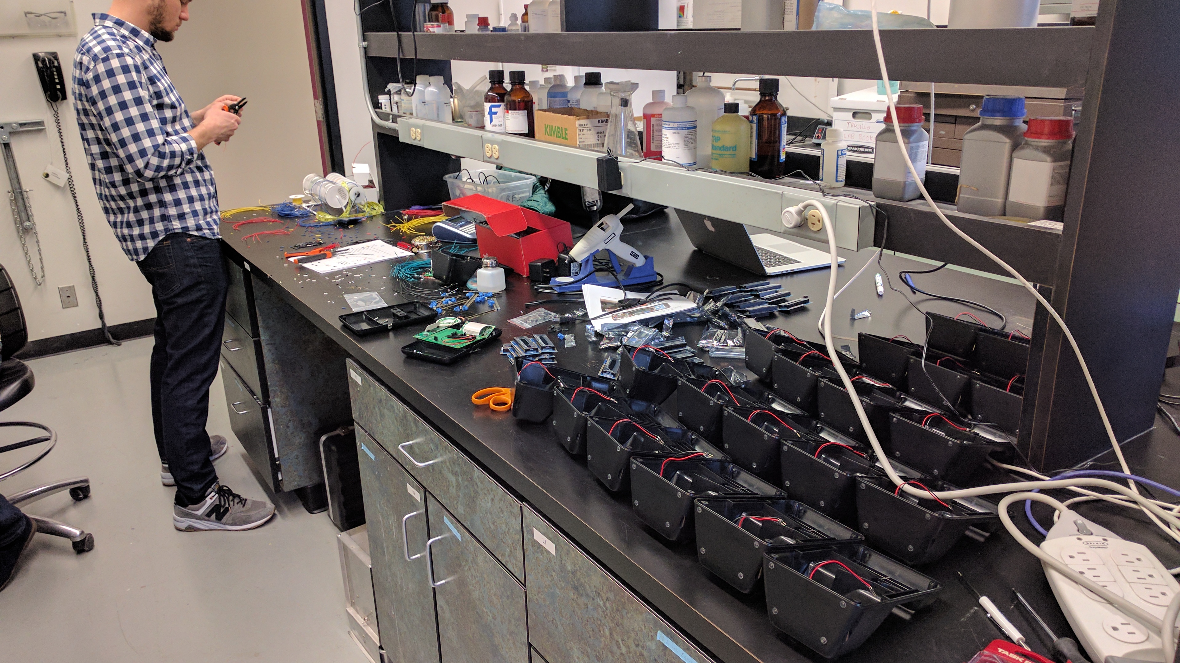
We bought and modified about 20 of these senors and arranged to deploy them in the homes of six asthmatic families. Each family would get three sensors to place wherever they liked. We let these run for about a month to collect some baseline data, then followed up with a tablet interface so people could interactively view and annotate their data, along with a Google Home for making voice annotations.
The Interface
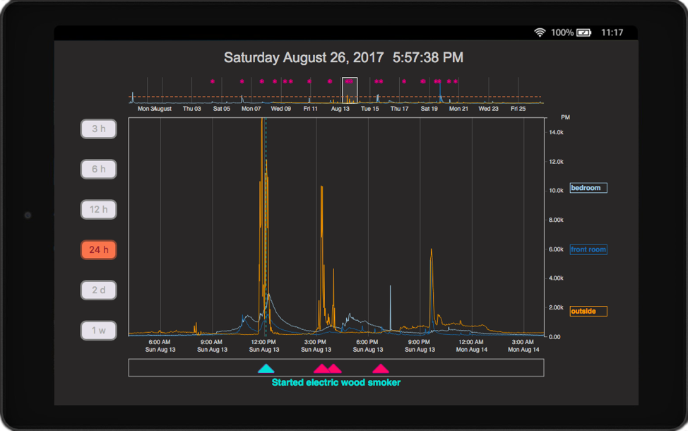
This was written in D3.js and is a modified Focus+Context block with some programmatic control of the brush widths to match user-selected zoom levels, on the left. This was skinned to look like Grafana and people really liked it! The red triangles indicate where users annotated their data, which people used to explain the source of measurement spikes, as a health journal to track their symptoms, or to log their behaviors to see what caused the air quality to deteriorate. The interface was intentionally stripped-down and kept simple because: (1) We didn’t want there to be a high barrier-to-entry, and (2) we weren’t sure what people might want to do with the system or their data, so we weren’t about to go bounding into designing something blind. This design served its purpose as a simple data review interface, and was good to get something in people’s hands so that we could get some feedback (and observations) on how they used it.
Data Processing, Spike Detection & User Alerts
These deployments ran for a while (up to a year), and collected a lot of data. This was challenging for fluidly displaying data on the cheapie Amazon fire tablets we used, as well as maintaining some visual fidelity of our minute-by-minute measurements from each sensor datastream.
The overplotting is real

(from: “Too Big Data: Coping with Overplotting”)
The chart portion of our interface had about 400 pixels of horizonal real-estate. Utilized fully, it’s possible to display 400 datapoints. Because our system logged data every minute, this only allows you to show at most 6.66 hours before you run into overplotting issues. Not a problem for our 3 or 6 hour view modes, but anything more needed some help.
Enter the ‘Largest Triangle, Three Buckets’ algorithm (demo here) fom Sveinn Steinarsson’s master’s thesis: “Downsampling Time Series for Visual Representation. Inspired by cartographic methods for preserving coastline features on maps, this wonderful algorithm allowed us to downsample our data into a visually similar reproduction of arbitrary time ranges. You need to convert 50,000 datapoints into a visually-equivalent 1000 point plot? This does it. A great piece of work and exactly what we needed to maintain fluid interactivity and visual fidelity of people’s jagged and dynamic air quality measurements. Simply using a windowed aggergation approach would have smoothed out those dynamics, which was a big no-no for us.
Detecting and alerting spikes
We used a variant of the Smoothed Z-Score algorithm to detect the presence of spikes for each air quality sensor’s data streams. We used these triggers to fire off some “just-in-time intervention”-style text messages (via Twillio) to alert users of an air quality ‘event’ in their homes, and have them text us what they thought the cause to be. This served multiple purposes in our study, but mostly to collect a self-annotated dataset, and keep participants engaged with their own deployment.
Interviewing
We interviewed our participants multiple times throughout their deployments to capture how their experience with the system and knowledge of air quality changed over time. These were semi-structured interviews, and proceeded from a set of questions, but with enough latitude to discuss and explore interesting feedback as we encountered it
- Pre-deployment interivews: This was mostly meeting people to explain the study, and capture some baseline knowledge and demographic information about our particiapnts and their overall knowledge about air quality, and things they felt to be important.
- Deployment interviews: These intereviews happened roughly 1 month later (once we had collected enough air quality data), and were part demonstration of our system, how to use the interface, and how to make annotations with text and google home. We also asked how people imagined using it and other personal-priotiy style questions
- Post-deployment interviews: Sometime later, we followed up with another round of interviews to get feedback on people’s experience with using the system. This was a mix of what they liked, did not like, what they learned, etc.
We wrote up our paper and submitted it, but reviewers (rightfully) asked why so few people engaged in the interviews. Surely if these were “household” deployments, shouldn’t more people be involved? Well, we tried to encourage people but no one other than the primary particiapnts seemed interested. However, it was worth looking into why, so we ran an additional round of “engagement” interviews:
- Engagement interviews: Each deployment received two interviews: one with hte primary particiapnt, and one with “everyone else in the home”. All to determine what were the factors that motivated or influenced the interviewee’s level of engagement. Spoiler alert: it’s a lot to do with personal impact. If you aren’t affected, you’re less likely to care.
The Results
We report on four findings in the paper. Stated very briefly:
Having multiple sensors lets you make comparisons
Having sensors throughout your home lets you see how localized air quality can be, and how activities in one area of the house can affect the others.
The ability to annotate your data improves the over-all user-experience and sense of engagement
It’s easy to forget what you had for breakfast, and even easier to forget what a squiggle on a screen might have meant 2 days ago. Making annotations improves data legibility, memorability, and user-engagement with a system deployment.
The interactive interface w/ data annotations let people explore their data
People liked looking back over their data to review it. The annotations made that possible!
People used this system for a long time! Texting was very popular!
In a field where most user-studies are conducted anywhere from a single afternoon, to a few weeks, having such a long-term deployment was valuable to see how people used their systems in the limit. We were happy to see people maintained a very high engagement rate (over 80%), a year into the study, and that most people gravitated toward making annotations primarly through texting. Everyone like getting messages, and they were easy enough to respond to.
Recommendations
People want to do more than “compare two sensor streams”
Data logging systems could benefit from some more sophisticated practices. Fitbit, etc. give you your data as a linear timeseries graph. that’s not how people think of things and in stead, comparing on conditions would be nice.
text messages are a good way to collect data from people
People’s continued engagement with their air quality systems was due in large part by how effective our text messaging system was. Simple, light-weight, and low-overhead. Some even came to treat the text message as its own proxy for air quality. If we’re texting them, then something must be up.
People’s personal knowledge and usage patterns change over time
Because experience levels and preferences changed over time, it would be nice to understand some best practices for designing flexible systems that grow with people’s needs to offer different functionalities depending on skills, goals, knowledge, etc.
Reflections
- Don’t roll your own data collection backend or architecture. It is a tar pit of edge cases and unexpected behaviors.
- Google Home will be used for playing music and making jokes. Very little data will come from it.
- If texting people, it’s helpful to let people set their own rules and preferences for when they want to be messaged. This would have aleviated some frustrations, as well helped up to collect more data. Lesson learned.
Recommended Reading
Tolmie 2016 - “This has to be the cats” — A great read on how “personal” personal data can be, and how much it relies on the specific knowledge of lives and routines in order to meaningfully interpret.